
AliExpress基础链路体验升级
Core Commerce Journey Redesign
项目背景 Project Background
在电商中是与用户关系最为紧密的实属基础链路了,其中包括详情页、购物车、下单、支付、支付成功、物流、订单、售后这一连串的链路。尤其是详情页,无论是新人场景站外到站内、大促场景、购买场景都是用户的必经之路。因此作为设计师需要以用户为中心,以用户需求为目标进行产品设计,同时还要兼顾业务需求和商业价值。用户体验的概念从产品的最早期就开始进入整个流程,并贯穿始终。其目的就是保证:
对用户体验有正确的预估;
认识用户的真实期望和目的并加以利用;
在功能核心还能够以低廉成本加以修改的时候对设计进行修正;
保证功能核心和人机界面之间的协调工作;
The core commerce journey is where users have the most continuous interaction with an e-commerce product, spanning:
Product Detail → Cart → Checkout → Payment → Order → Logistics → After-sales
Among these touchpoints, the Product Detail Page (PDP) is particularly critical. It is often the first key interaction for new users arriving from external channels, and a core decision-making touchpoint during both promotional and everyday shopping scenarios.
As a product designer, I approached the experience from three perspectives:
User Needs × Business Goals × Commercial Value
Rather than optimizing individual pages in isolation, I looked at the entire journey as a connected experience.
The goal was to:
Understand user expectations before they enter the core journey
Identify friction and unmet needs throughout the funnel
Validate design decisions before they become expensive to change
Maintain consistency between product functionality and user experience
现状分析 Current State Analysis
我把数据分为整体大盘数据和B0-B4用户数据,分别按照DAU、L-D、D-O、O-P这个链路以此去看每一步漏斗的数据和转化率。其中B0用户规模最大,转化率最差,跳失率最高,因此我会优先解决B0用户的体验问题。
I analyzed the journey from both overall platform data and user-segment data (B0–B4).
The core funnel was broken down into:
DAU → L-D → D-O → O-P
I compared key metrics at each stage, including user volume, conversion, and drop-off rate, to identify where the largest experience opportunities existed.
Key Finding
B0 users represented the largest user population, while also showing:
The lowest conversion
The highest drop-off
The greatest potential impact from experience improvements
This led to a clear prioritization:
Instead of optimizing the journey for the average user, I prioritized the B0 experience first.
The next step was to identify why B0 users were dropping out at each stage of the journey, and translate those behavioral signals into concrete product and UX opportunities.
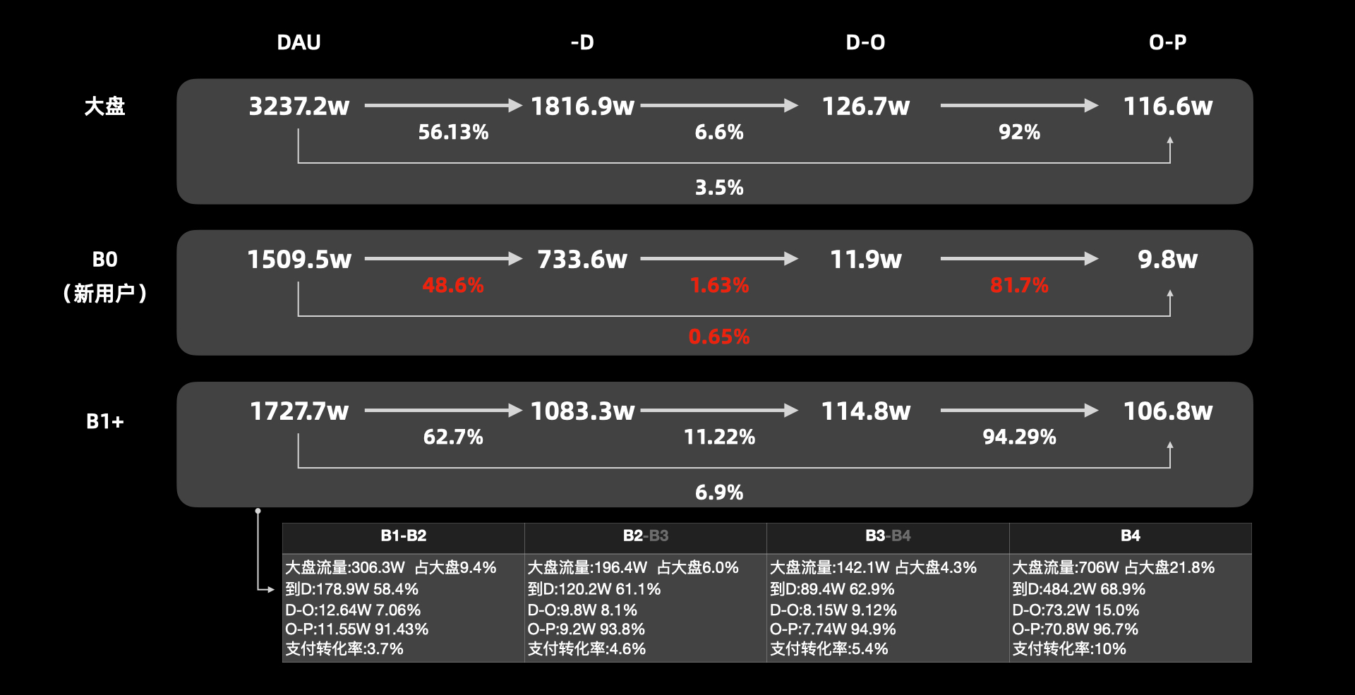
于是我进一步拆解了新用户的转化关键节点,其中包含用户从站外到站内L-P三端分开的数据:
I further broke down the key conversion touchpoints for new users, analyzing the journey from off-site traffic to on-site conversion across the three L-P touchpoints.
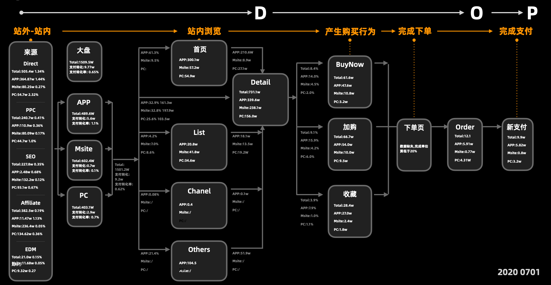
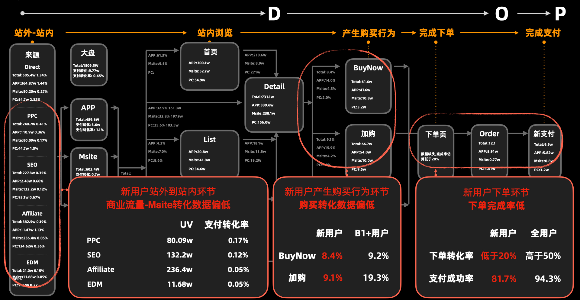
最大的问题:
1. 新用户从Msite站外到站内UV规模大但是支付转化率只有0.1%
2. 新用户产生购买行为环节中,购买数据偏低
3. 新用户下单环节中,下单完成率低于整体水平
Key Issues Emerged:
Low Conversion from Off-site to Payment
New users from M-site off-site traffic generated significant UV volume, but the payment conversion rate was only 0.1%.Low Purchase Intent
Among new users who entered the purchase journey, the overall purchase volume remained low.Low Order Completion
New users showed a lower order completion rate than the overall user base, indicating significant friction during checkout.
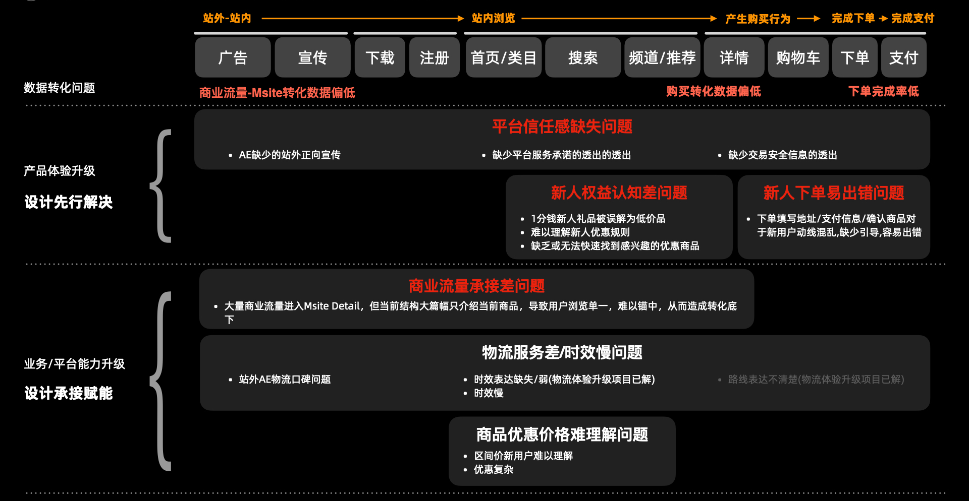
带着这份数据,我就开始思考AE每天花了很多钱投放大量广告把新用户引到站内,但是承接效率却如此低。于是我又去做了次用户调研,针对目标国家用户0-1的跃迁去挖掘新用户转化的主要卡点在哪个环节。
通过用户调研我发现:
1. 新用户对平台信任感低,平台缺乏了服务保障承诺的透出
2. 新用户对新人权益不理解,不懂规则,对低价商品产生质疑,没有找到心仪商品从而对平台降低了购买兴趣
3. 新用户在下单环节容易出错,问题出在下单要填写大量信息,而平台缺乏足够引导
4. 商业流量承接差,大量用户在Msite进到站内,承接页只展示当前商品,导致用户浏览单一;其次平台没有做到投承一体,没有保障用户所见即所得。
From Data to User Insights
The data revealed a clear gap between traffic acquisition and conversion.
AliExpress was investing heavily in paid traffic to bring new users into the platform, yet the downstream conversion remained low.
This led me to a key question:
Where exactly do new users lose confidence or intent during their first journey?
I conducted user research focused on the 0→1 transition of users in target markets, mapping the key friction points from landing on AliExpress to completing a purchase.
Key Insights
01 — Trust
New users had limited trust in the platform.
Service guarantees and purchase protections were not sufficiently visible at key decision-making moments.
02 — Value & Product Discovery
Users struggled to understand newcomer benefits and their rules. Extremely low prices also created skepticism.
At the same time, limited product discovery made it harder for users to find something they actually wanted to buy.
03 — Checkout Friction
The checkout process required users to provide a large amount of information, while guidance was insufficient.
This increased errors and created friction at the final conversion stage.
04 — Poor Traffic Landing Experience
Paid traffic was not being effectively connected to the on-site experience.
Users arriving from M-site were often shown only the advertised product, resulting in a narrow browsing experience.
More importantly, the ad promise and landing experience were not fully aligned, creating a gap between what users expected and what they actually saw after entering the platform.
The Core Problem
These findings reframed the problem from:
“How do we improve conversion?”
to:
“How do we build trust, intent, and continuity across the entire first-time user journey?”
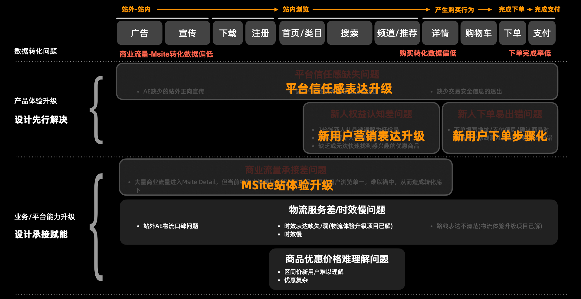
对应的策略依次是:
1. 平台信任感表达升级
2. 新用户营销表达升级
3. 新用户下单步骤化
4. Msite体验升级
Design Strategy
Based on these insights, I defined four design directions:
01 — Strengthen Platform Trust
Make service guarantees, purchase protection, and platform credibility more visible throughout the user journey.
02 — Redesign New User Marketing
Simplify the communication of new-user benefits, offers, and rules, while improving product discovery and purchase motivation.
03 — Simplify Checkout
Break the checkout process into clear, guided steps, reducing information overload and user errors.
04 — Upgrade the M-site Experience
Improve the transition from off-site traffic to on-site discovery, creating a more relevant and continuous landing experience.
设计方案 Design Solutions
平台新人表达升级
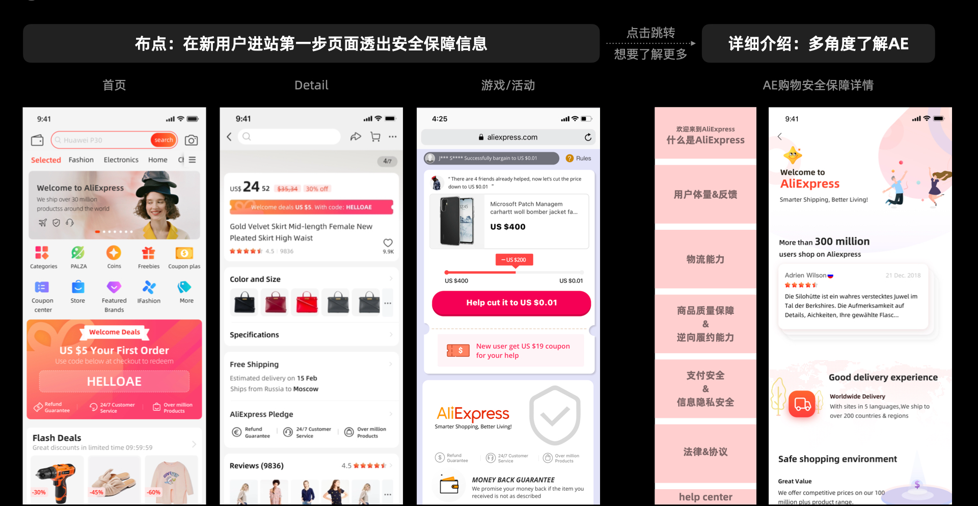
安全保障信息透出
首先布点,在新用户进站的承接页面透出安全保障信息,其中包含了首页、详情页、社交互动回流页。然后用户如果感兴趣打开了解详细介绍可以多角度了解AE。
Platform Trust Expression
Make Safety & Protection Visible
To address the trust gap among new users, I introduced safety and service guarantees at key entry points across the first-time journey.
Rather than adding more information to a single page, I strategically surfaced trust signals across:
Homepage → Product Detail → Social Return Page
Users could first see concise reassurance at the moment of entry, then progressively explore more details if they wanted to understand AliExpress's guarantees and services.
Design Logic
Entry → Reassure → Explore → Build Trust
The goal was to make platform credibility visible without overwhelming the user, turning trust from a hidden service capability into a tangible part of the shopping experience.
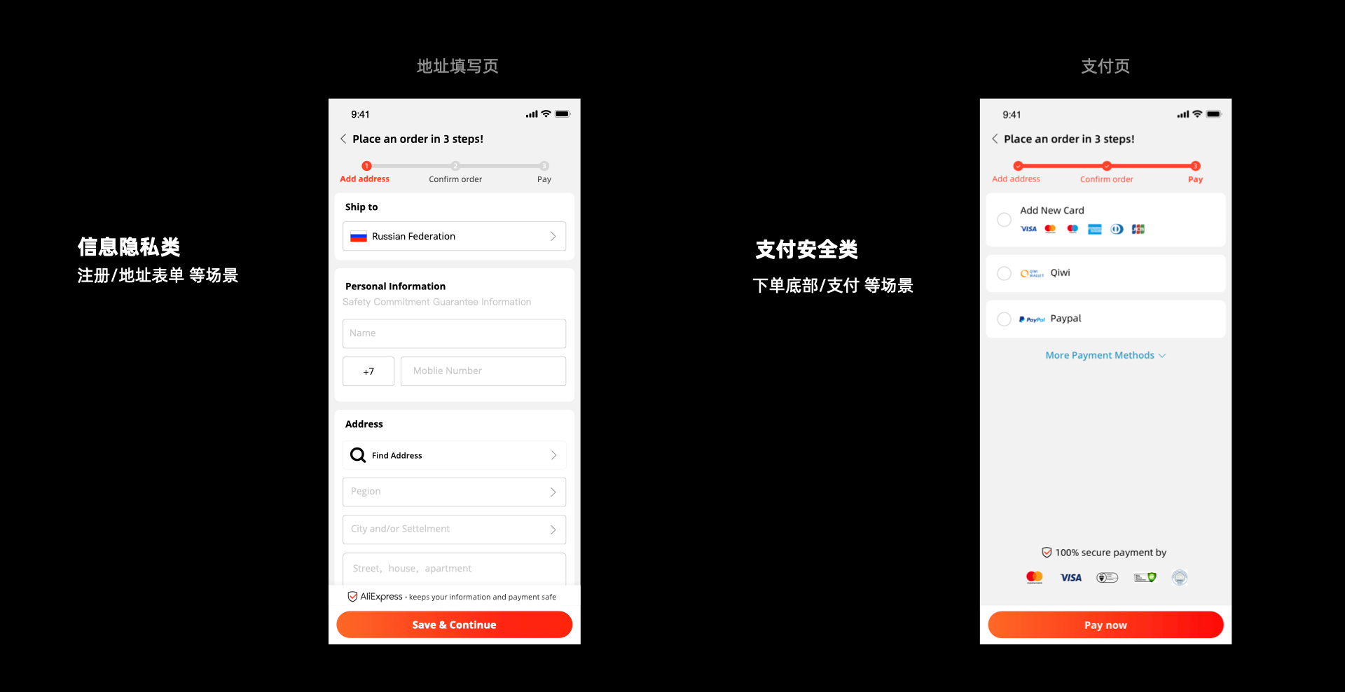
地址填写/支付页引到用户完成并做到信息隐私和支付安全
Guide Users Through Address & Payment
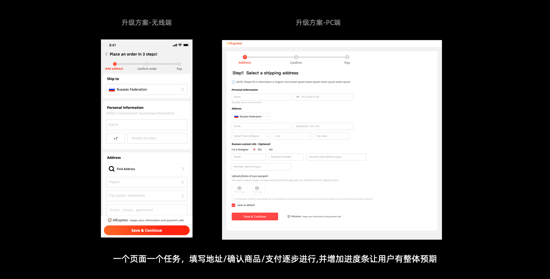
New users often dropped off or made errors when entering shipping and payment information. I redesigned the flow into clear, step-by-step guidance, helping users complete each stage with less cognitive load.
At the same time, I made privacy and payment security more visible at key moments, reinforcing trust when users were most sensitive to risk.
Address → Review → Payment → Confirmation
The goal was to turn a complex checkout process into a guided, secure, and confidence-building experience.
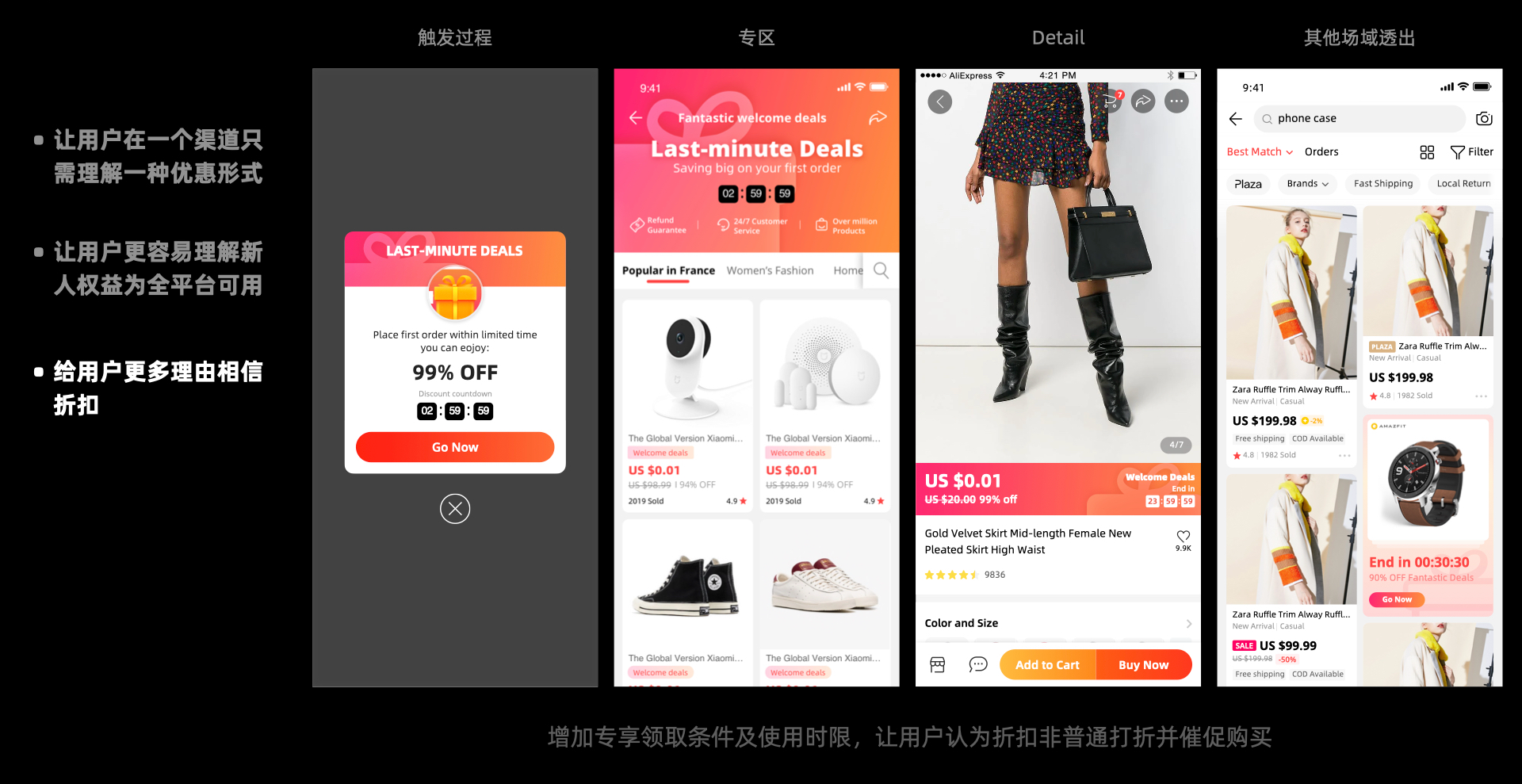
2. 新用户营销表达升级
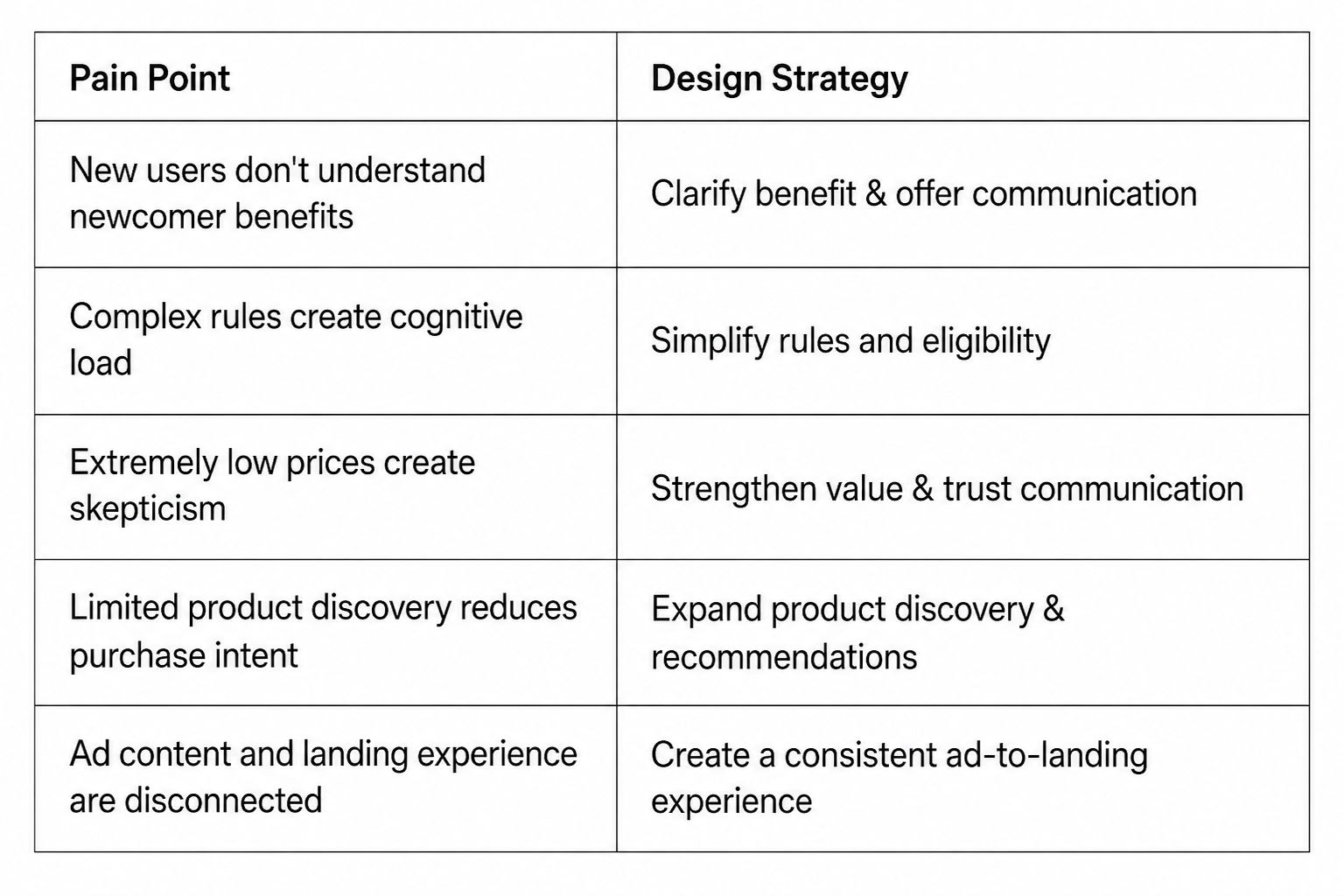
线上痛点和对应策略:
2. New User Marketing Experience
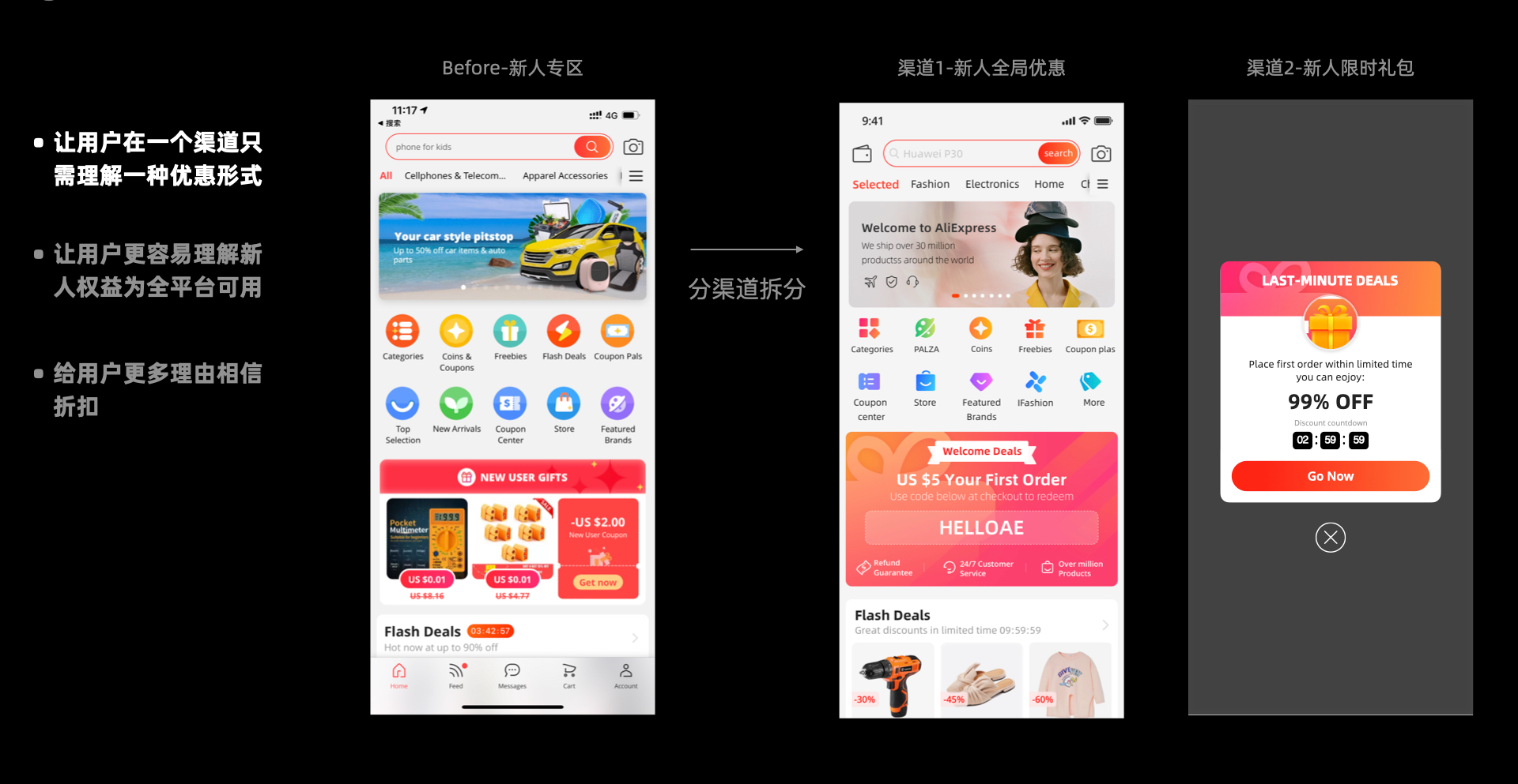
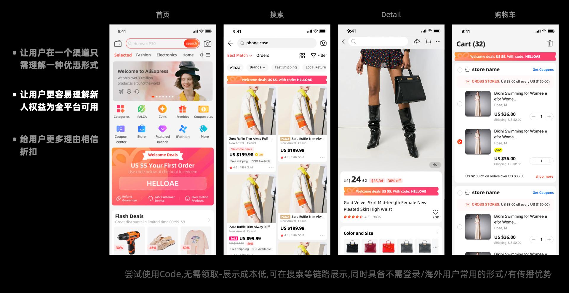
Online Pain Points & Design Strategies
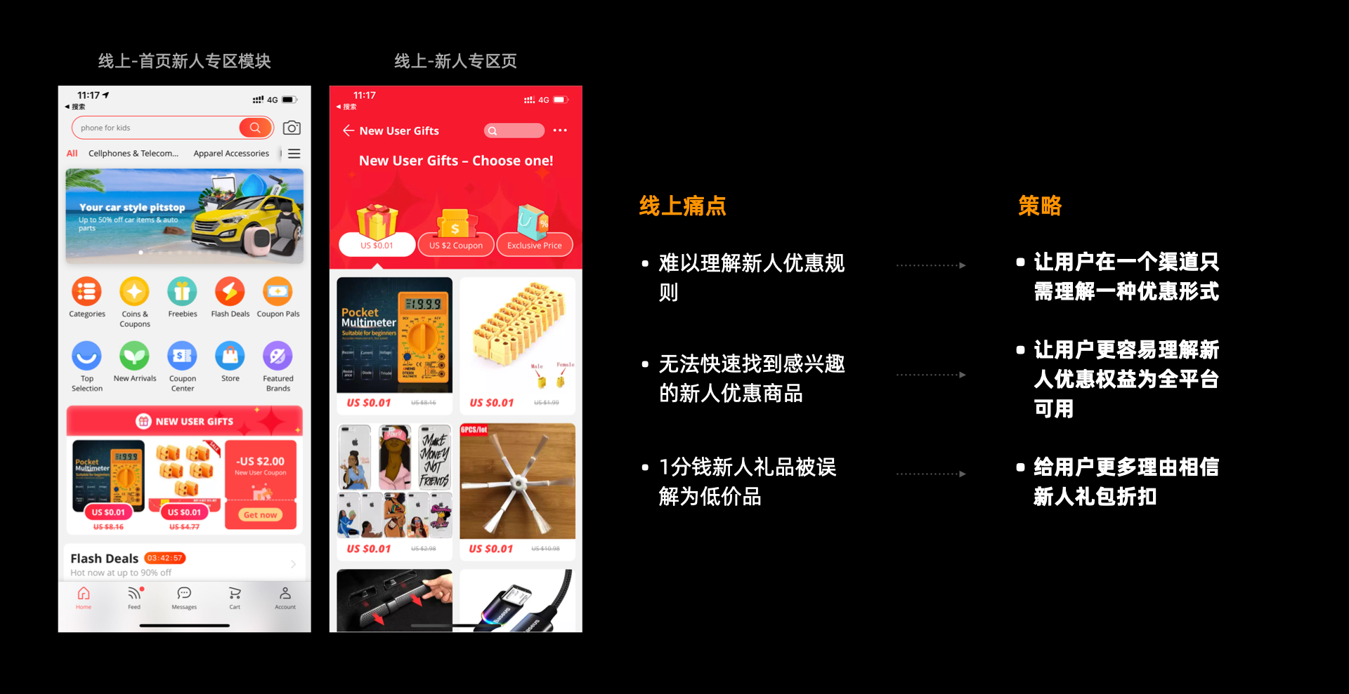
设计方案 design solutions:
3. 用户下单链路升级
购物车体验升级
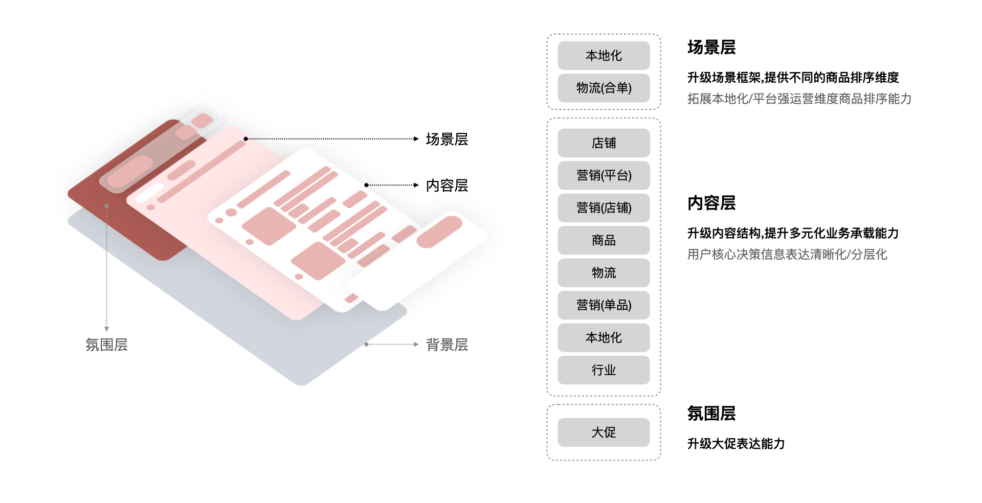
改版要点:a. 首先针对整体框架/信息表达规范的升级,让用户决策更清晰; b.增加跨店唯独联合结构,满足平台型凑单/本地化运营业务需求,让用户更容易完成跨店凑单。
按照内容层,氛围层,场景层,内容层划分,依次罗列了展示内容:
3. Checkout Journey Optimization
Cart Experience Redesign
Information Architecture
Restructured the overall layout and standardized information hierarchy to make product comparison and purchase decisions clearer.Cross-Store Bundling
Introduced a cross-store aggregation structure to support platform-wide bundle purchasing and localized operations, making it easier for users to complete multi-store purchases.Layered Information Design
Organized the cart experience across three layers:Content Layer → Atmosphere Layer → Scenario Layer
Each layer serves a different purpose, balancing information clarity, promotional context, and purchase scenarios.
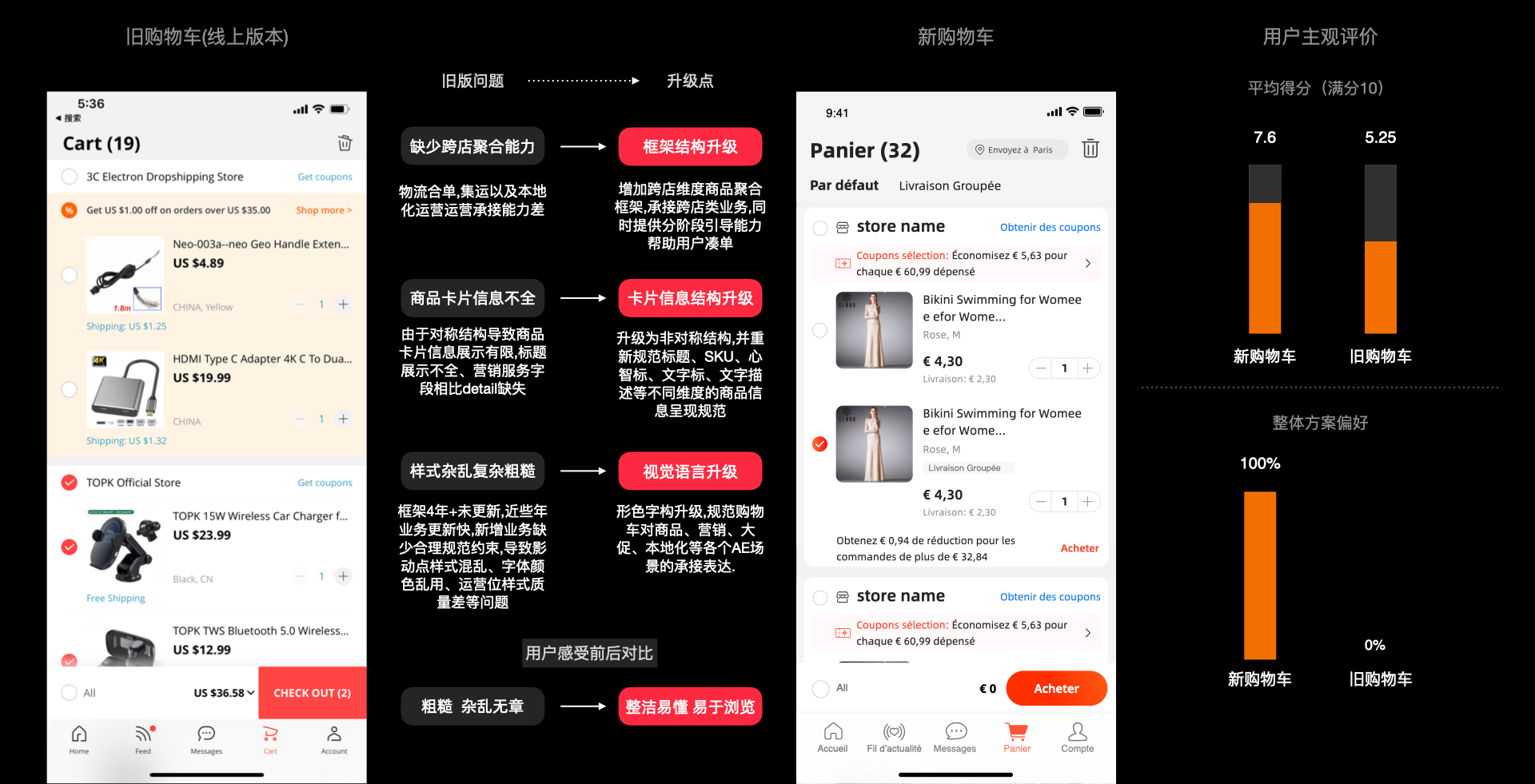
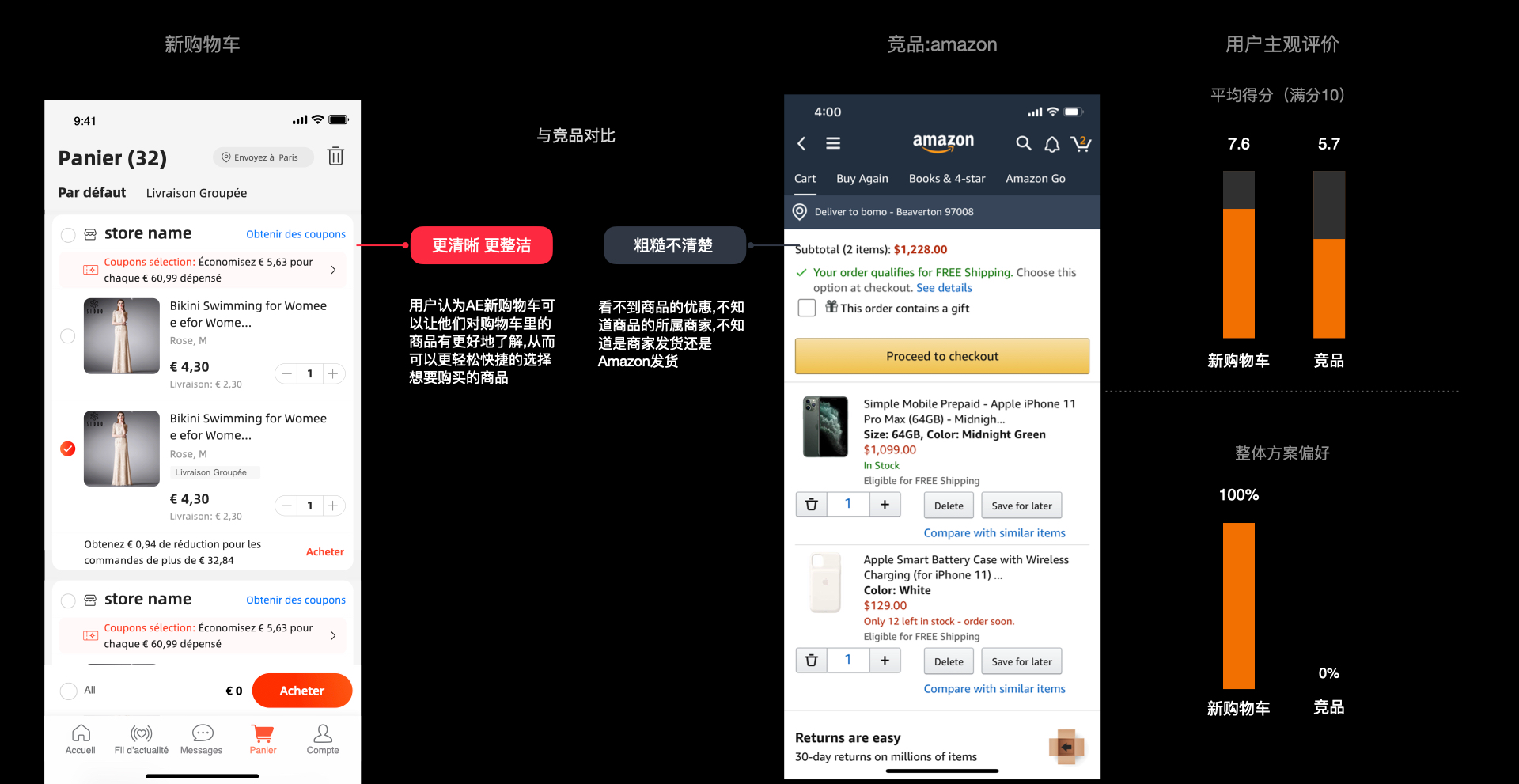
旧版的问题和优化方向,以及用户对新旧版购物车的满意度打分:首先用户能够更明显感知到新版的变化,认为新版更加丰富/井井有条/更美观,但同时表示希望优惠营销信息能够更加聚合;其次用户表示新的聚合维度是有趣的,用户能够理解新的维度下的凑单引导以及认为这是对他们购物有帮助的,同时认为凑单表达和描述更加本地化,相较于旧版更容易理解。
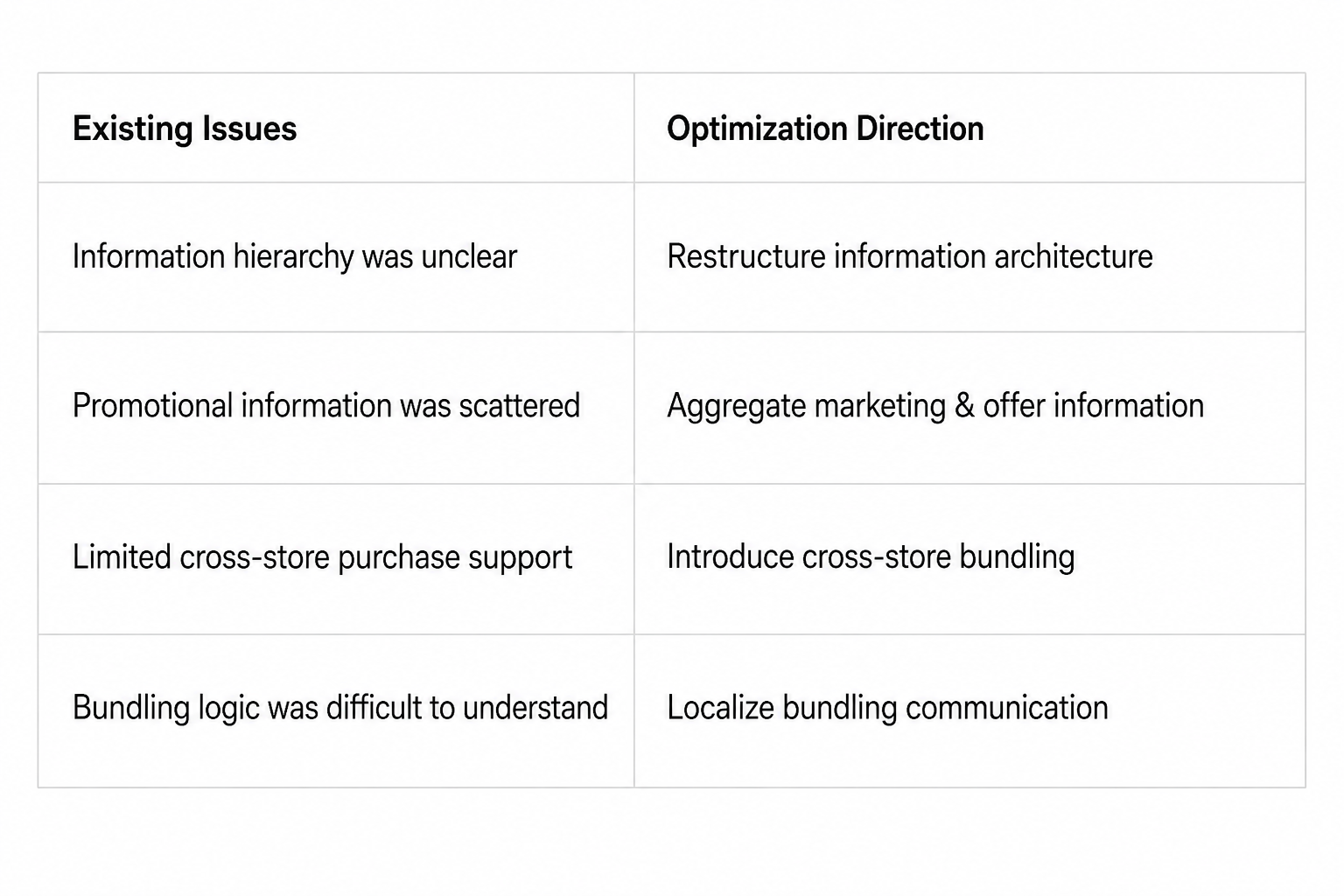
User Validation
User testing showed that the new cart was more noticeably different, richer, more organized, and more visually appealing than the previous version.
Users also found the new cross-store aggregation interesting and easy to understand. They could follow the bundling guidance and felt it was genuinely helpful for completing their purchases.
The new bundling communication was also perceived as more localized and easier to understand.
Key Feedback
More organized · More engaging · Easier to understand · More helpful
One remaining opportunity was to further consolidate promotional information, making discounts and marketing benefits easier to discover and compare.
新版购物车对比竞品:
Benchmarking the New Cart Experience Against Competitors:
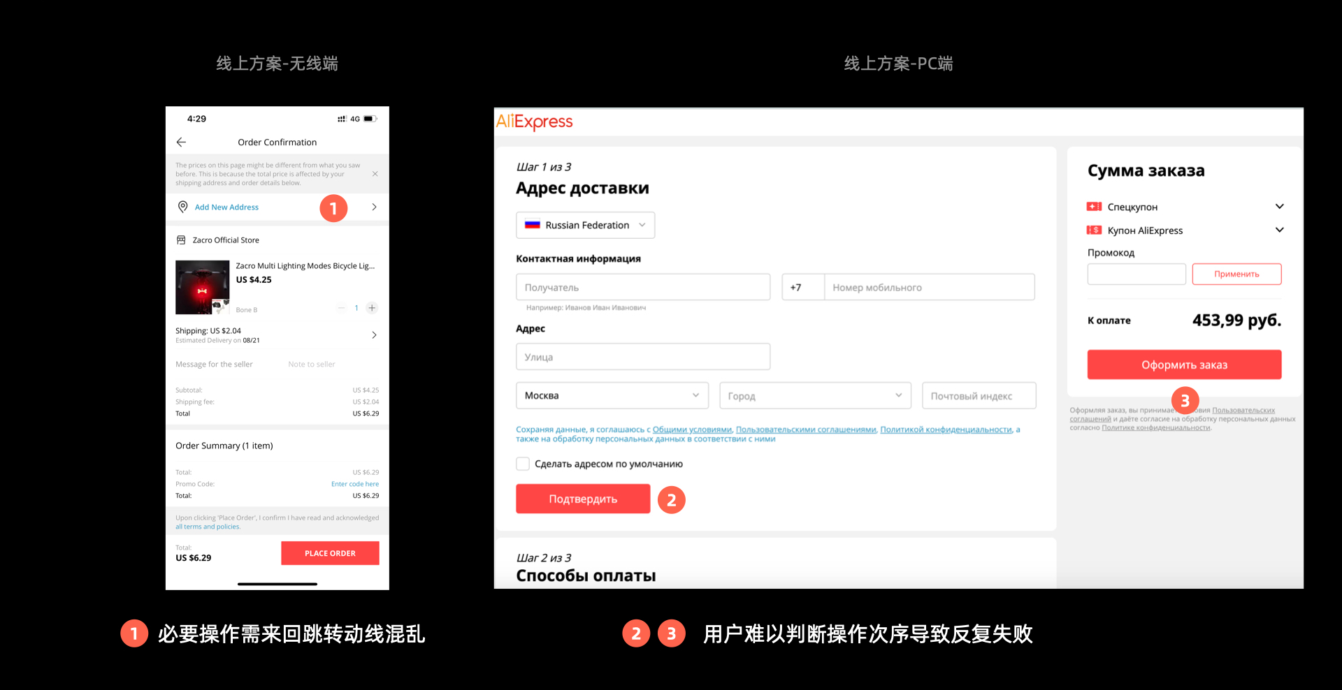
下单步骤引导 Checkout Step Guidance
旧版存在的问题
Issues with the Previous Version:
新版引导新用户完成支付:
Guiding New Users Through Payment in the New Experience:
物流全链路体验升级
物流是用户在下单之前最关注的信息之一,因此在搜索页,详情和购物车要重点清晰的表达物流信息。
End-to-End Logistics Experience Upgrade
Logistics is one of the most important factors users consider before making a purchase. Therefore, logistics information needs to be presented clearly and consistently across key decision-making touchpoints, including the Search Page, Product Detail Page, and Shopping Cart.
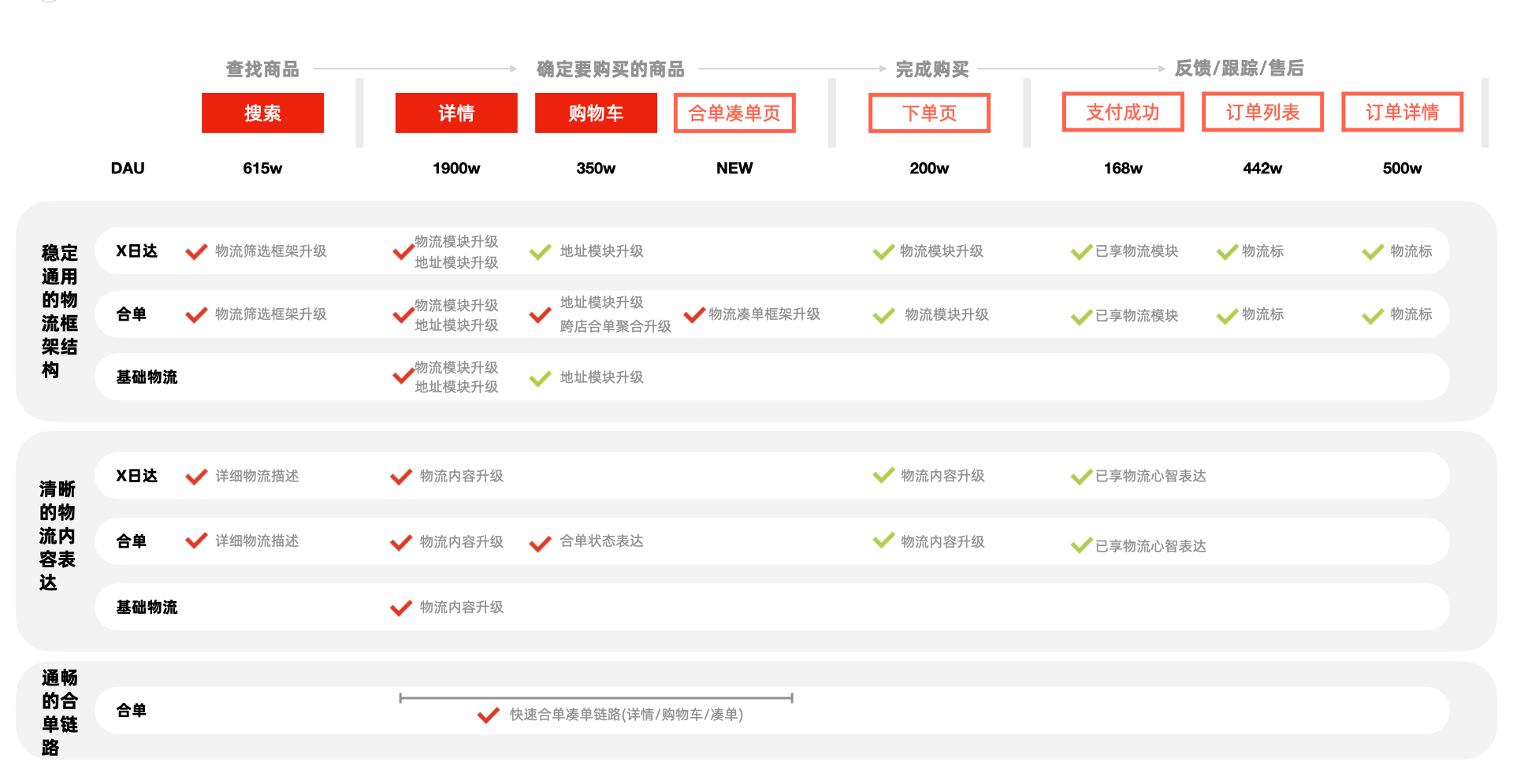
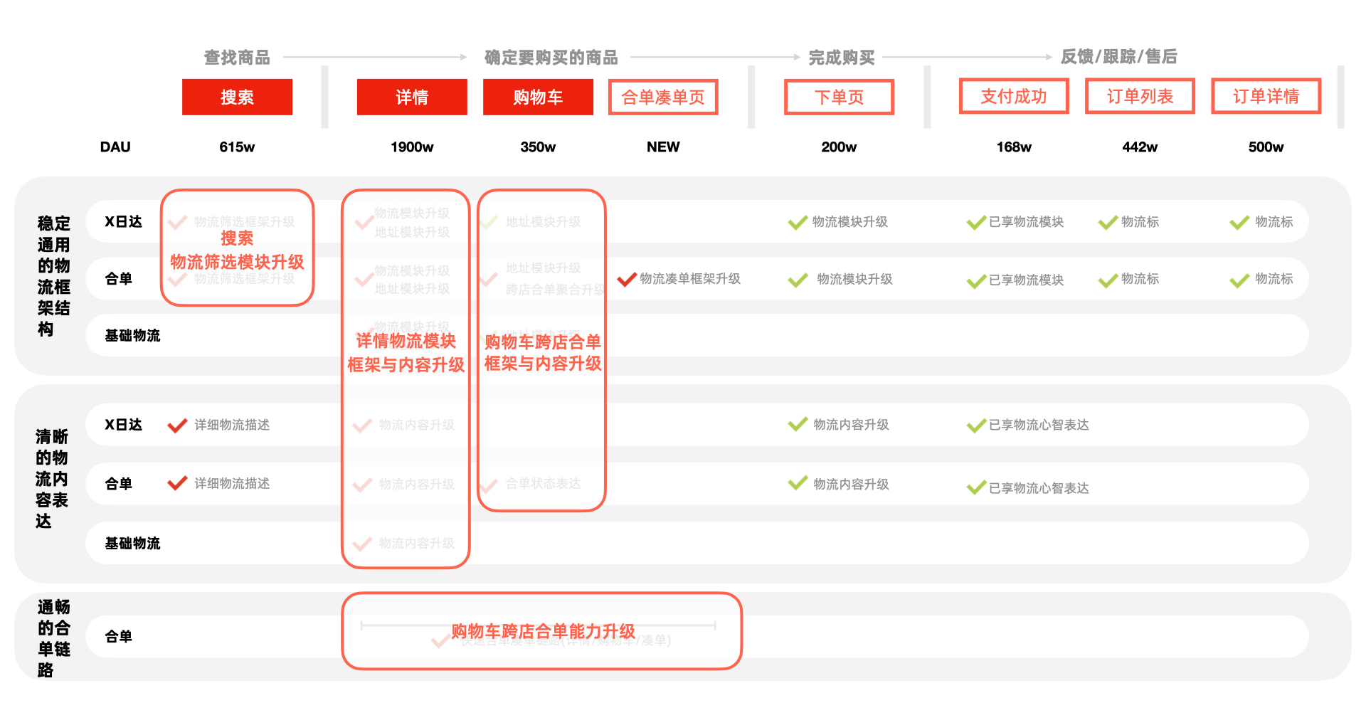
优化内容主要集中在搜索页,详情页,购物车以及购物车跨店合单的整条链路能力升级。
The optimization focused on the end-to-end logistics journey, spanning the Search Page, Product Detail Page, Shopping Cart, and cross-store order consolidation experience.
设计方案:
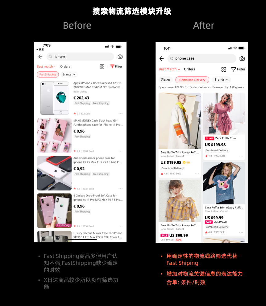
用户在搜索页面通过物流筛选商品:
改版前:a. Fast Shipping商品多但是用户认知不强, 且Fast Shipping缺少确认的时效,用户不明确到底多久; b. X日达商品少没有筛选功能。
改版后:a. 用确定性的物流线路筛选代替Fast Shipping; b. 增加对物流关键信息的表达(合单的条件和时效)
Design Solution
1. Use Logistics Filters on the Search Page
Before:
a. There were many Fast Shipping products, but users had limited awareness of the service. More importantly, Fast Shipping did not provide a specific delivery timeframe, making it unclear when the order would arrive.
b. Products with guaranteed delivery dates were limited, and there was no corresponding filter.
After:
a. Replaced the ambiguous Fast Shipping filter with specific logistics routes that provide more predictable delivery expectations.
b. Added key logistics information, including order consolidation conditions and estimated delivery time, to help users make more informed purchase decisions.
2. 详情页物流模块升级
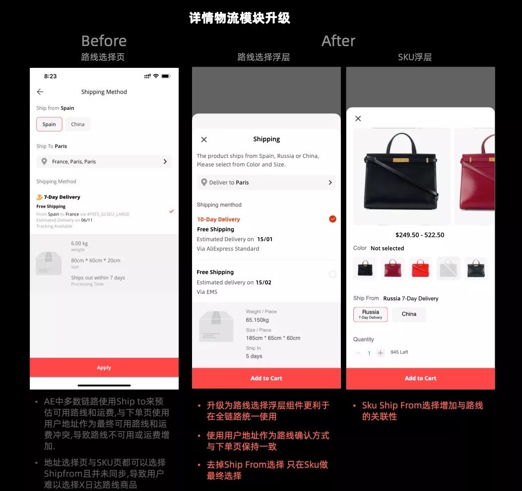
改版前:a. AE中多数链路使用Ship to(通过手机定位)来预估可用路线和运费,与下单页用户地址作为最终可用路线和运费产生了冲突,导致路线不可用或下单时运费增加; b. 地址选择与SKU页都可以选择Ship from且并没有同步,导致用户难以选择X日达路线商品
改版后:a. 升级为路线选择浮层组件更加利于在全链路统一使用; b. 使用用户地址作为路线确认方式与下单页保持一致; c. 去掉Ship from选择,只在SKU做最终选择; d. SKU Ship from选择增加与路线的关联性
2. Product Detail Page — Logistics Module Upgrade
Before:
a. Across most of the AliExpress journey, “Ship to” relied on phone location to estimate available shipping routes and costs. However, the checkout page used the user's actual address as the final basis, creating inconsistencies that could result in an unavailable shipping route or increased shipping costs at checkout.
b. “Ship from” could be selected both in the address selection and SKU modules, but the two selections were not synchronized, making it difficult for users to identify products eligible for X-day delivery.
After:
a. Introduced a shipping route selection overlay as a reusable component to create a consistent experience across the entire journey.
b. Used the user's delivery address as the source of truth for confirming available routes, aligning it with checkout.
c. Removed the “Ship from” selection from the address module, leaving the final selection to the SKU level.
d. Linked the SKU-level “Ship from” selection directly to the available shipping routes, making delivery options and timelines clearer.
3. 物流描述表达升级
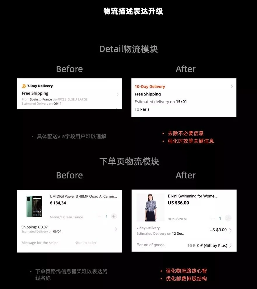
详情页物流模块:
改版前:具体配送via字段用户难以理解
改版后:去除不必要信息,强化时效等关键信息
下单页物流模块:
改版前:下单页路线信息框架难以表达路线名称
改版后:强化物流路线心智,优化运费排版结构
3. Logistics Communication Upgrade
Product Detail Page — Logistics Module
Before:
The specific “via” field was difficult for users to understand.
After:
Removed unnecessary information and emphasized key details such as delivery time.
Checkout Page — Logistics Module
Before:
The existing information structure made it difficult to clearly communicate shipping route names.
After:
Strengthened the shipping route mental model and optimized the shipping fee information hierarchy.
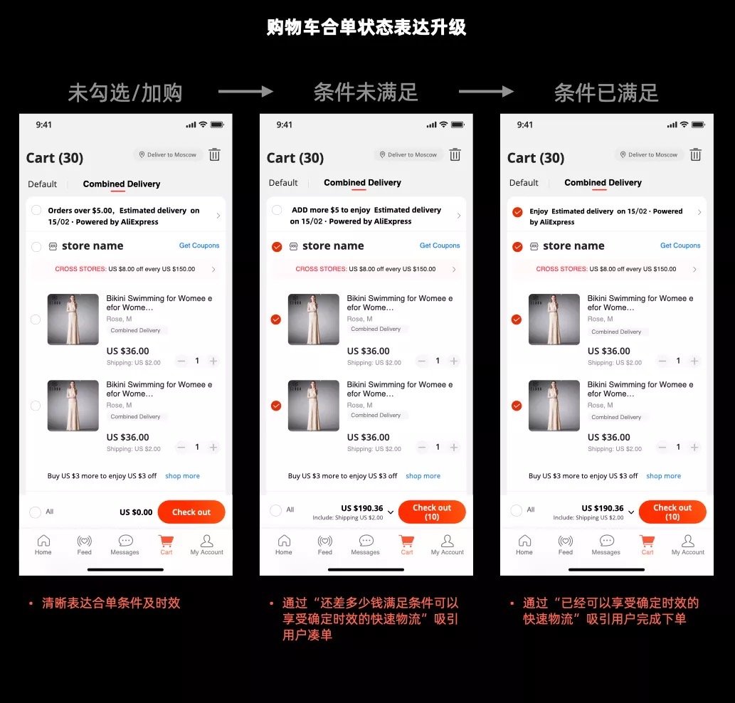
4. 购物车合单状态表达:
改版后:a. 未勾选状态时清晰表达合单条件及时效; b. 满足合单条件,通过“还差多少钱满足合单即可享受确定时效的快速物流”吸引用户凑单; c条件已满足,通过“已经可以享受确定时效的快速物流”吸引用户完成下单
4. Cross-Store Consolidation Status
After:
a. Before Selection: Clearly communicate the consolidation requirements and estimated delivery time.
b. Condition Not Yet Met: Encourage users to add more items by showing how much more they need to spend to qualify for faster shipping with a guaranteed delivery timeframe.
c. Condition Met: Reinforce the benefit by highlighting that users already qualify for faster shipping with a guaranteed delivery timeframe, encouraging them to complete the purchase.
5. 快速合单路径升级
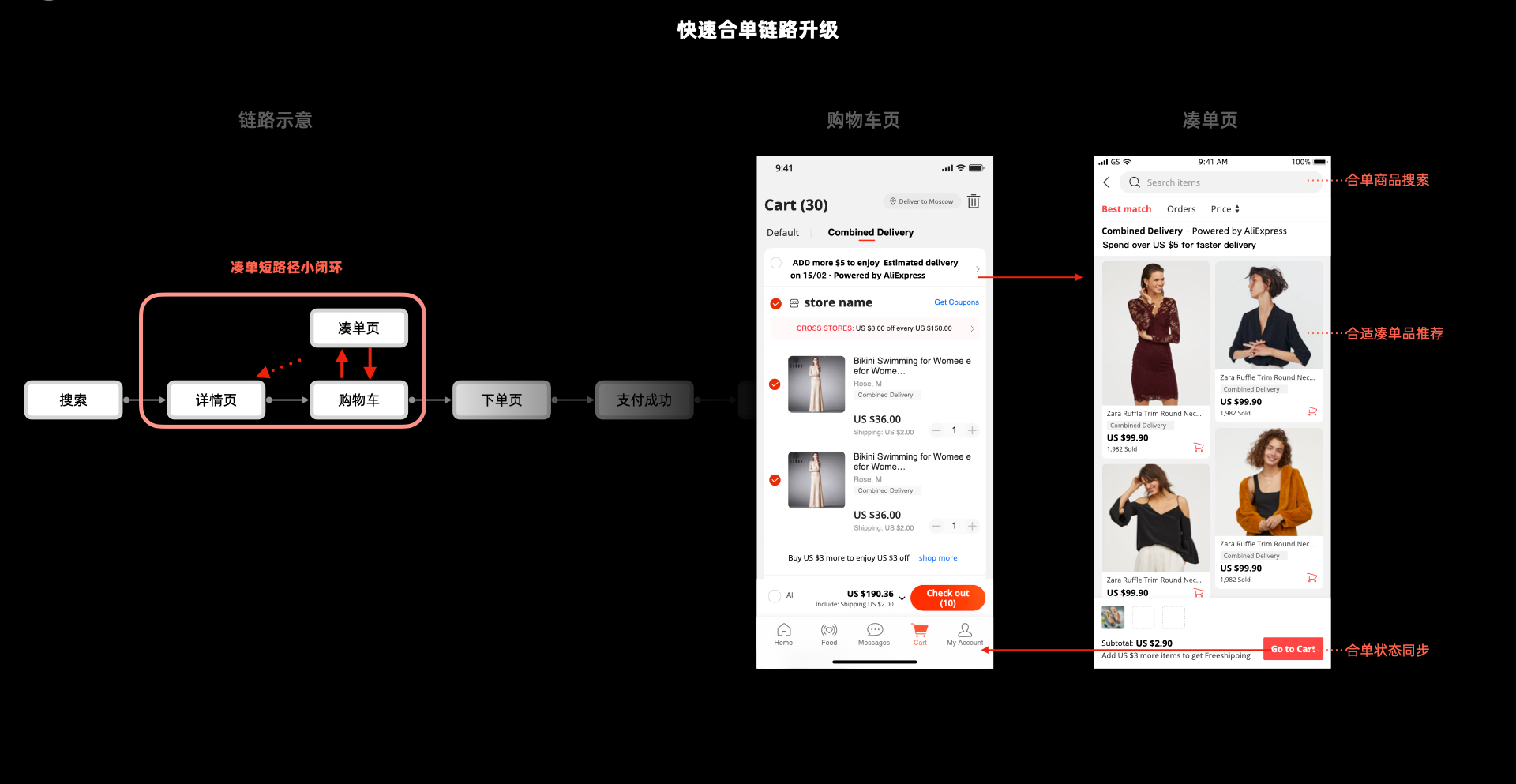
为了缩短凑单的路径,在凑单的场景形成一个小闭环,从而快速帮助用户凑单并下单。增加凑单页用户无需经过详情页便可直接在购物车完成凑单。
5. Fast Consolidation Flow Upgrade
To shorten the bundling journey, I created a closed-loop experience specifically for the consolidation scenario, helping users quickly add items and complete their purchase.
A dedicated bundling page was introduced, allowing users to add items directly from the shopping cart without navigating through the Product Detail Page, significantly reducing the path from “add more to qualify” → “complete purchase.”