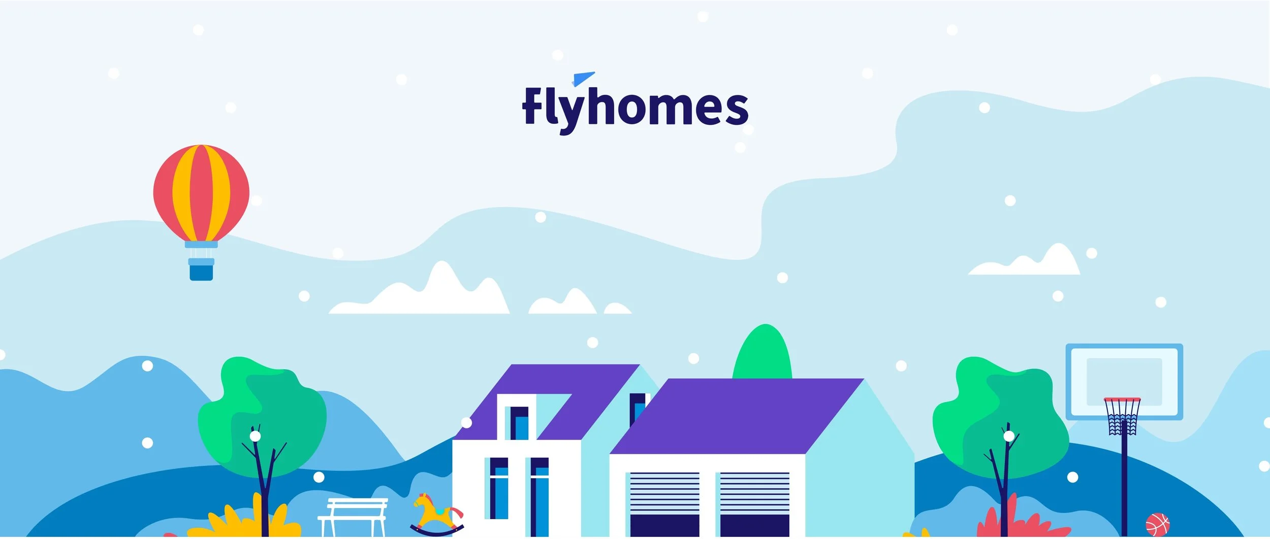
The New Look of Flyhomes
Competition between real estate industry is sharp in Seattle. To stand out among the competitive companies as a startup, we need to be unique and recognizable by customers. To celebrate the new look, I’m sharing the story behind the new logo as well as the history of the original logo and our name itself. We’re also switching to Flyhomes from FlyHomes, a natural extension of our new logo.

Back in the day (2015)
This is the first logo change since 2015. Our founders, Steve and Tushar, were in business school together when the company was named and the original logo was commissioned. Most of the original brand creation happened between Steve, Tushar, a group of friends and classmates, and a survey.
Once the name was settled, Steve and Tushar commissioned a logo, reviewing a variety of options and collaborating until the final logo was nailed.

The New Look
The new logo features squared design with rounded corners. This approach reflects the huge decisions we help clients make every day—real estate is serious, and the squared shapes with a heavier weight help ground our new logo. We also celebrate with clients every day—that sense of fun is reflected in the rounded corners and lowercase letters.

The icon version of our logo is an evolution of our original airplane icon. The new icon uses rounded corners to represent collaboration and the boundless possibility our company offers.


Proposal
I started by brainstorming oodles of options, then whittled the group down to a final set.

Colors
New colors are inspired by the seasonal colors in Seattle, home of the Flyhomes HQ. I play with these colors. Every client we work with is an individual and the idea is to give a different pop to different people.


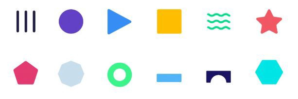
Shapes
I developed a system of geometric circles, squares, triangles, and waves to tell Flyhomes’ stories and our clients’ stories.

Illustration
I defined our illustration guideline. The characters are fashionable, young but not too funky, rounded layout for each character, hair ends with rounded line to wrap with the hair frame. Main style of plants can be long and wavy leaves with multiple different types of plants. Colors can have sub colors based on the primary colors but no pure black #000000.

Website
After branding redesigned, we had a desire to make brand consistent across all media. Website is the most important product to review our services, search homes, schedule meetings with our agents for all buyers and sellers. I worked with CEO to outline the general overview of the website, the unique value provided to our clients and defined the scope of the website design. Then, I started to create the sitemap and wireframe to ensure all the key pages and feathers had been considered, to show their relationship between each other and define navigation structure. I worked with Head of Design to create visual/UI design. Before launched, I tested internally and made adjustments accordingly such as specs modification and finally had it reviewed and approved by the project stakeholders. After launched, I still worked on maintenance.
Homepage

Sell

Buy

Mortgage

Crew

Other design
My job responsibility is not limited to UI/UX design. I worked with marketing team to create our flyers, postcard, banners and maintenance social media, I created a visually graphics image to let customers have best to a first impression of our new brand.
Doodles for social media


Cash offer banner


Postcard
